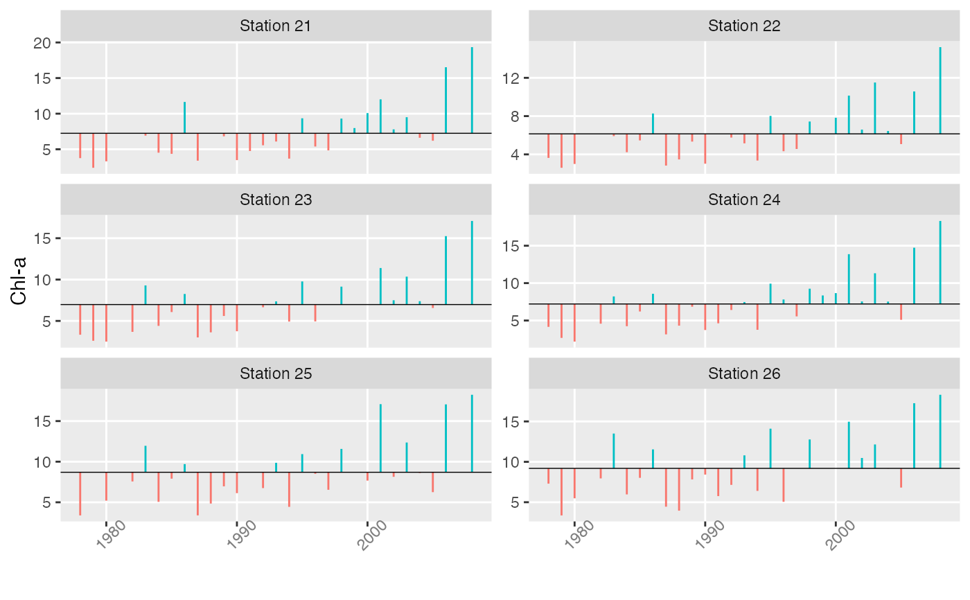
Series are illustrated by vertical lines extending from individual data values to the long-term mean. The axes are not scaled in any way. Anomaly plots are useful for visualizing shifts in time series levels.
plotTsAnom(x, xlab = NULL, ylab = NULL, strip.labels = colnames(x), ...)Arguments
- x
matrix or vector time series
- xlab
optional x-axis label
- ylab
optional y-axis label
- strip.labels
labels for individual time series plots
- ...
additional options
Value
A plot and corresponding object of class “ggplot”.
Details
Options are passed to the underlying facet_wrap function in
ggplot2. The main ones of interest are ncol for setting the
number of plotting columns and scales = "free_y" for allowing the y
scales of the different plots to be independent.